Fintech Dashboard — Wealth Management Platform (Celery)

Project Overview

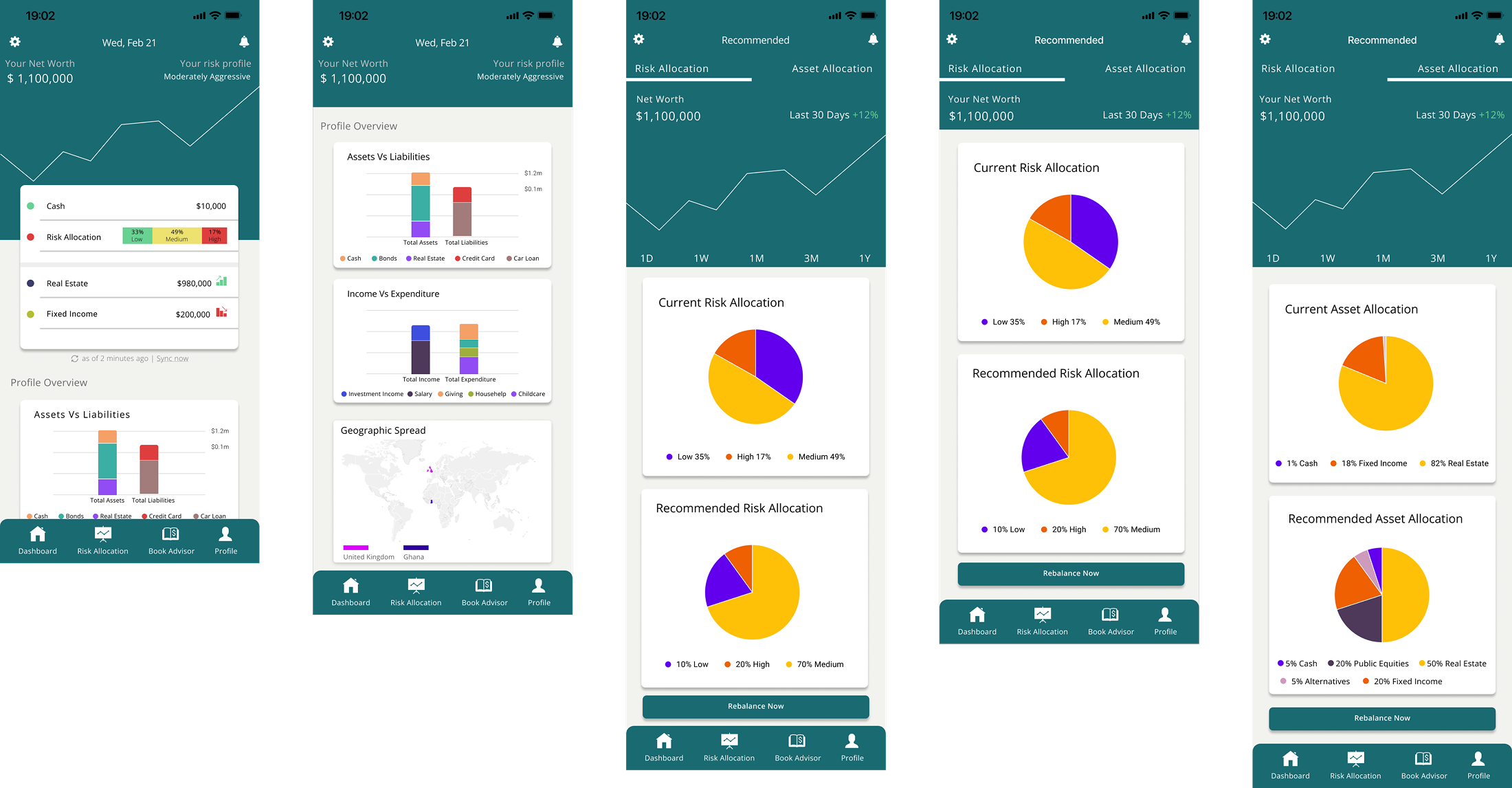
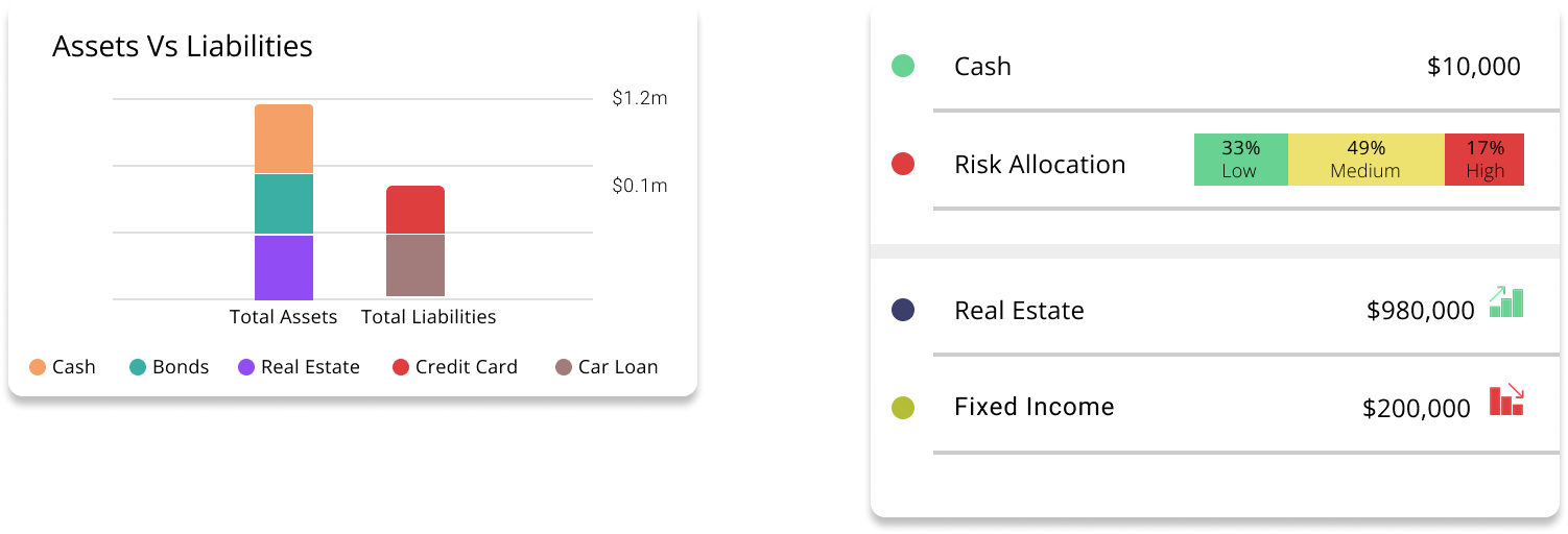
I designed a mobile dashboard experience for an AI-powered wealth management startup, Celery. The goal was to simplify complex financial data — such as net worth, asset allocation, and risk exposure — into intuitive visuals that supported both retail investors and financial advisors.

Details
Time Frame:

2024

Role:

UI/UX Designer

Tools Used:

Figma, Components & Variants, Prototyping

Problem

Users struggled to understand the balance between assets and liabilities, current vs. recommended allocations, and risk exposure. The existing presentation of data was fragmented and lacked clarity.

My Role

  • UI/UX Design: Led the design of mobile dashboards in Figma, focusing on clarity and usability for data-heavy content.
  • Systemized Design: Applied components, variants, and reusable patterns for scalability across multiple modules.
  • Collaboration: Worked directly with founders, developers, and content leads to ensure designs aligned with product goals and could be implemented efficiently.

Solution

Results

The new dashboards positioned Celery to present financial data in a more trustworthy and user-friendly way, increasing stakeholder confidence and supporting investor decision-making.